When I first hear the phrase “Design Systems”, my mind populates images of huge industrial PCB boards that control various systems. While that isn’t what this means within the digital design world of UI/UX, the sentiment really isn’t too far off.
Those big control boards typically maintain a specific aesthetic throughout. There may be a specific color or shape for HVAC systems that keep the air breathable within a factory, and a completely different color and shape for the systems that control pressure regulation.
In a digital realm, the designer can really use this same logic when designing an ecosystem for an application, advertisement, operating system, etc. There needs to be a nuanced approach that makes the entire experience feel unified. Building a design system allows for you, or someone on your team to easily go in and adjust things as needed without a huge pain of reworking everything. Trying to remember what padding a button had no longer takes up real estate in your memory if you create a template for your system. You need to add a button for a new page? Just grab that saved template / component, edit it to your needs by changing the placeholder text, and boom. You’re done.
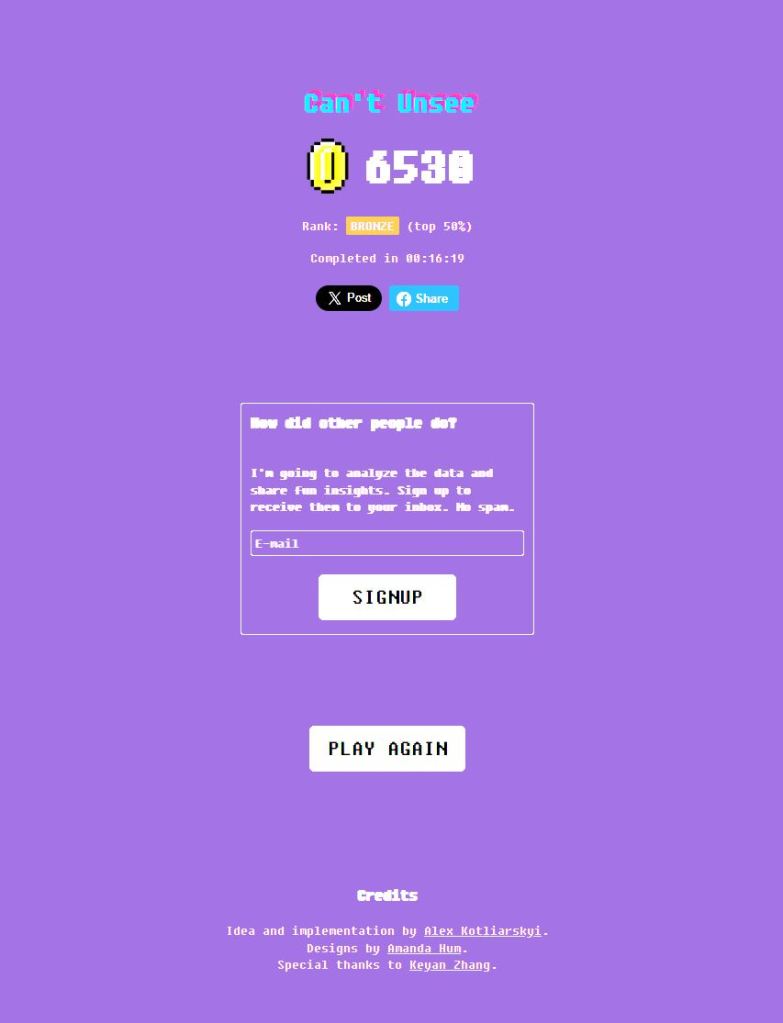
Today I took a fun little quiz that tests your ability to identify inconsistencies in UI examples. For someone who is still quite wet behind the ears within this realm, I feel I did pretty well. There were a few where I couldn’t place my finger on why one was right and the other was wrong, but I still chose correctly. After years of ingesting countless overarching design aesthetics and formularies, your eyes and brain begin to subconsciously recognize when something is jussssssssst a little off.
Take the quiz yourself, and drop your score!


Leave a Reply